Today I want to talk about a color that has made its way into the new trendy shades of 2020.
The color is called Cantaloupe and is inspired by the color of the cantaloupe melon. It is a softer and lighter undertone than the classic bright orange and this makes it a more versatile and easier to use shade than orange.
Cantaloupe is not a completely new color but it is an evolution of the trends of recent years. In fact, although it is less bright, it is close to Living Coral, the Pantone color of the year 2019. But above all it is a mix of two of the most seen chromatic trends in recent years: pastel colors and terracotta (I had talked about these hues here and here).
Like orange, melon is the color of vitality and the sun, capable of instilling a sense of energy and vitality but also of stimulating imagination and self-confidence.

 Photo: Omar Sartor

 Photo: Omar Sartor
 Photo: Danilo Scarpati
But how to use this hue and above all how to combine it with other colors? Here I propose 4 different palettes!
PALETTE 1 – SHADES OF CANTALOUPE
Cantaloupe is already a lively and bright hue that does not need other colors to be enhanced. The first palette that I propose therefore combines Cantaloupe with neutral colors (e.g. white or light gray) and then plays by combining different shades of the same color.


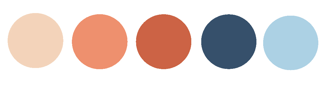
PALETTE 2 – CANTALOUPE and BLUE
It is the perfect match: orange and blue are complementary colors and therefore it means that they “satisfy” the eye. Furthermore, a contrast is created between a warm color (cantaloupe) and a cold one (blue) which makes the final result very interesting. You can therefore combine cantaloupe with blue or light blue, playing with the combination of different shades.

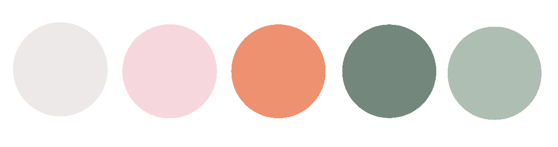
PALETTE 3 – CANTALOUPE and GREEN
Another combination that I like very much is the one between cantaloupe and green. In particular, sage green or mint green are a nice match.
The sage green, being less bright, slightly attenuates the cantaloupe and the final effect is softer and more peaceful. Mint green is instead a bright color and therefore the final effect will be more cheerful and intense, a real leap into the summer.

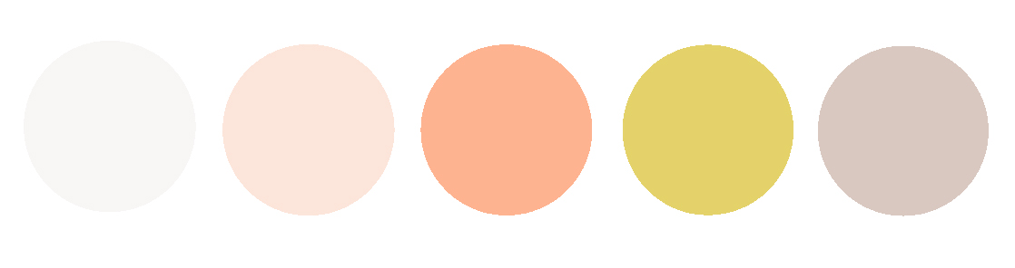
PALETTE 4 – CANTALOUPE and YELLOW
This palette continues the pastel colors trend that started in 2019. In this palette, inspired by the colors of sorbets and ice creams, I propose the combination of cantaloupe with a beautiful lemon yellow, for a truly sparkling and energetic environment. My advice is to play with the cantaloupe and lighter undertones of it – yellow should be used for accessories or details – you can also add a touch of lilac to create a nice contrast with the yellow.

Which is your favorite palette?

May i inquire what color goes well with melon color? Does lemon color complements?
Greetings! I plan to paint my small house with melon color.The gate and windows lemon color paint.Does lemon color goes well with melon color? Thanks.
Yes, they go well together! It is going to be a very energetic and happy house!